



Line Art vs. Watercolor Pet Portrait: How to Choose a Direction
Line art and watercolor can both feel personal, yet they ask a viewer to notice different things. One often emphasizes outline, shape, and graphic restraint; the other often emphasizes softness, colour movement, and an atmospheric impression. The useful choice is not to declare one better. It is to decide which visual emphasis fits the pet, the room, and the reason the portrait matters.
Start with the question behind the search
This page answers a focused question rather than trying to replace a broader guide. If you need the foundational vocabulary first, read the pet portrait definition. If you are comparing a neighboring choice, use the related decision guide as a separate decision path. Keeping those questions distinct helps prevent a good article from becoming a catch-all page.

Start with what you want a viewer to notice first
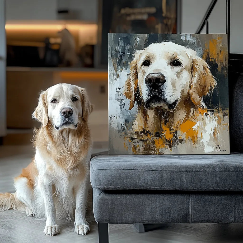
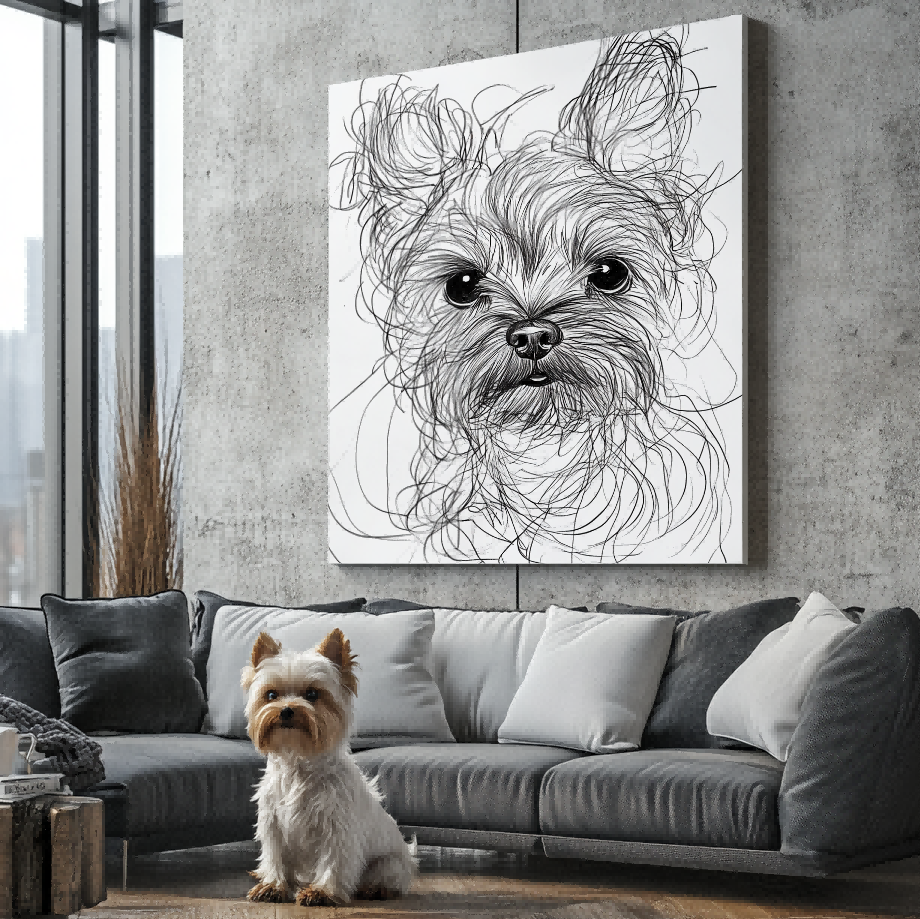
If the pet’s silhouette, ears, posture, or a clean graphic presence matters most, a line-led direction may be easier to describe. If the overall feeling of colour, softness, and a gentler visual mood matters more, a watercolor-led direction may be the better question to investigate. Neither label guarantees a result; use it to identify the preference you need to verify.
Use the room as a decision aid, not a rule
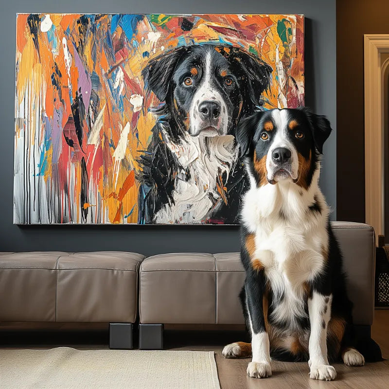
A quiet room can support a more graphic focal point, while a layered or softer space may invite a looser treatment. That is only a starting point. Look at the wall, nearby colours, and how much visual energy you want the portrait to add rather than relying on a universal room formula.
Keep likeness criteria visible in either direction
Before choosing a style label, list the features that make the pet recognisable: eye shape, markings, muzzle, ears, or a familiar posture. A style decision is more useful when it begins with those visible facts rather than with an assumption that any treatment will preserve every detail in the same way.
Build a short decision note before comparing live choices
The value of a focused guide is that it helps a reader avoid carrying an unspoken assumption into the next step. For “Line Art vs. Watercolor Pet Portrait: How to Choose a Direction,” write down the visible detail, display context, or practical concern that actually matters to you. Then separate it from the information you still need to confirm on a current page. This distinction is especially useful when search results use the same word for a style, a product family, a material-sounding label, or a delivery format.
- 1. Start with what you want a viewer to notice first. Write one sentence about this point in relation to your own pet, room, or intended use. Doing so turns a broad search phrase into a specific comparison and reveals whether you need another photo, an example, or a current product fact before deciding.
- 2. Use the room as a decision aid, not a rule. Write one sentence about this point in relation to your own pet, room, or intended use. Doing so turns a broad search phrase into a specific comparison and reveals whether you need another photo, an example, or a current product fact before deciding.
- 3. Keep likeness criteria visible in either direction. Write one sentence about this point in relation to your own pet, room, or intended use. Doing so turns a broad search phrase into a specific comparison and reveals whether you need another photo, an example, or a current product fact before deciding.
A short note also helps when more than one person is involved in the choice. One person may care most about the expression in the reference photo; another may care about how a direction fits the room or daily use. Naming both priorities gives the current product information a clearer job: it can answer what is available, while the reader keeps ownership of the personal decision.
Use the reference photo as evidence
Whatever direction you are considering, the source image should help a reader identify the pet rather than hide the decision behind a style word. The best photo guide explains how to inspect eyes, expression, markings, lighting, and clarity. The real before-and-after guide is useful context for noticing the difference between a meaningful image and a general description.

Questions to carry into the current page
Before treating any option as a match, check the information that only the live page can establish. That might include the precise style name, the product format, image requirements, material, dimensions, current price, inventory, production timing, delivery terms, or whether a particular change can be requested. A search snippet, an old article, or another store’s example cannot answer those questions for Palette Tales. Keeping these facts separate from the educational choice protects both the buyer and the meaning of the portrait.
Keep an educational guide separate from a live promise
Articles can explain how to frame a decision. They cannot confirm an exact style, product format, material, editing capability, price, inventory, production time, delivery date, or outcome. Use the Customer Preview Gallery to review visual context, then check the current portrait collection for current information. If a specific detail matters, ask it directly at the moment of choice rather than relying on a past example or a competitor statement.
A practical next step
Save one or two photographs that show the details you would want a viewer to recognise, and write down the single question this guide helped you answer. That small preparation makes it easier to compare a live option without turning a style label or a source image into a promise. A thoughtful choice is usually clearer when the visual evidence, the intended use, and the current product information all point in the same direction.


