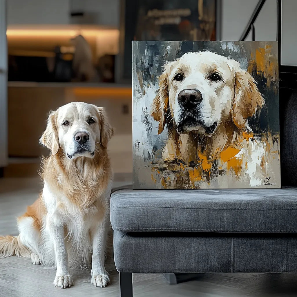
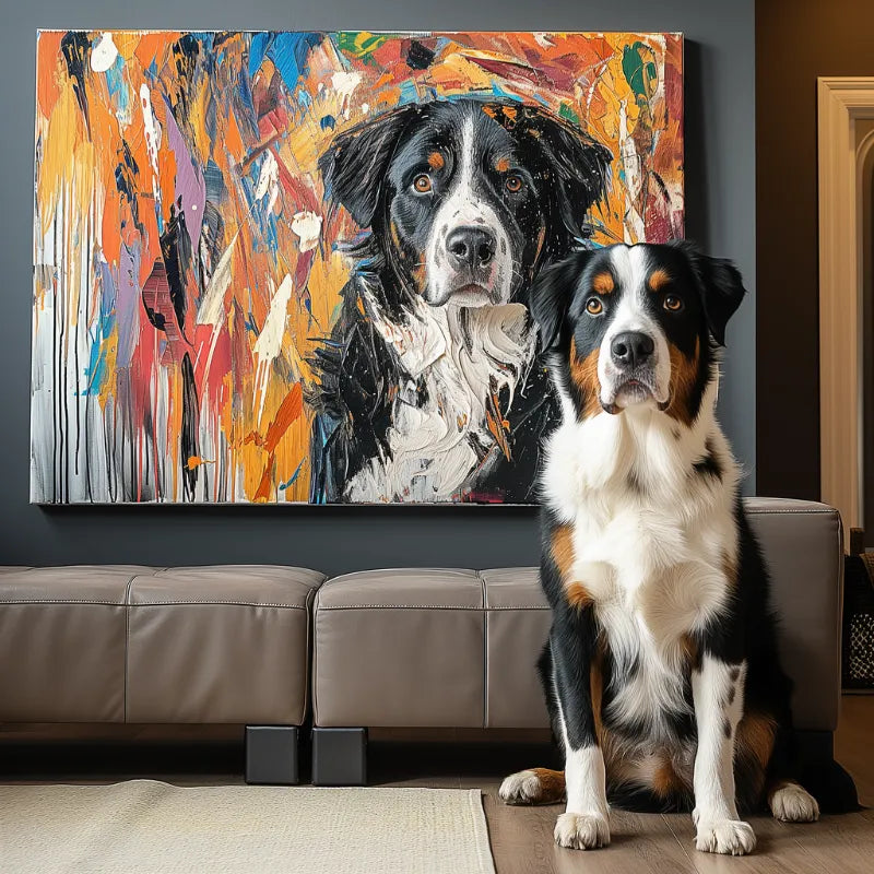
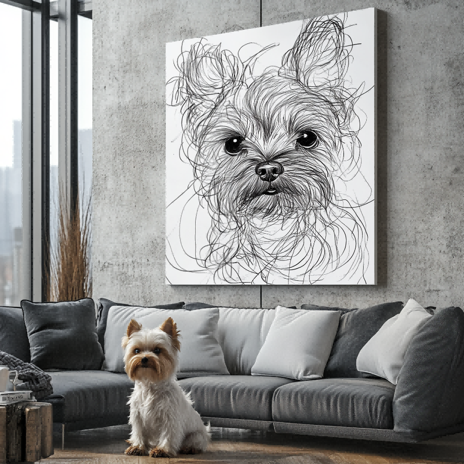
Canvas color codes use systems such as HEX and RGB for digital color references and CMYK for print workflows. They describe a shade more precisely, although screen and printed colors can still look different.
When I first started looking into custom pet portraits, I honestly didn't think much about color. I figured I'd just pick a photo I liked and let the printer figure it out.
Turns out, that's not really how it works.
If you want your pet's portrait to actually look like them—and not some weird, washed-out version—the colors need to be right. Like, exactly right. That's where color codes for canvas come in. If you're curious what these look like on an actual finished piece, check out the portrait styles Palette Tales offers here.
I've spent enough time around custom printing to know that getting the color right isn't as simple as picking "brown" for your dog and calling it a day. There's a whole system behind it—HEX codes, RGB, CMYK—and once you understand the basics, it's a lot easier to get a portrait that actually looks like your furry friend.
Let me break it down in plain English.

Okay, So What Exactly Are Color Codes for Canvas?
Color codes are standardized ways to describe a shade. HEX and RGB are common in digital design, while CMYK describes a print-oriented color model. They make color conversations more specific than broad labels such as “blue” or “warm brown.”
For custom artwork, a color reference can help explain the mood or background you prefer. It should still be reviewed in context: screens display color differently, printed output can vary, and the pet photo remains the most important visual reference.
If a room color matters to your decision, share the reference during the artwork review and judge the overall composition in the preview rather than expecting a screen-to-print color guarantee.
After choosing the color reference you want to communicate, you can compare how those tones work across the Custom Pet Portrait collection.

HEX, RGB, CMYK: What's the Difference and Why Should You Care?
This is where people's eyes usually glaze over. But stick with me—it's not that complicated.
HEX codes are what you'll see most often on websites and in digital design. They're those six-character codes that start with a #, like #FF6B6B for a soft coral red. If you're browsing online and see a color you like, the HEX code is how you save and share it.
RGB stands for Red, Green, Blue. This is the color system used for screens—your phone, your computer monitor, your TV. When we show you a digital proof of your pet portrait, we're using RGB to make sure it looks vibrant and accurate on your device.
CMYK stands for Cyan, Magenta, Yellow, and Key (Black). This is the printing system. When your portrait actually gets printed onto canvas, the printer uses CMYK to mix those four colors in different amounts and reproduce your image. This is why what you see on screen (RGB) doesn't always look exactly the same on paper or canvas (CMYK)—the two systems work differently.
These systems serve different purposes: HEX is a convenient digital reference, RGB describes screen color, and CMYK is associated with print workflows. Knowing the difference helps you ask clearer questions without treating any code as a guarantee of identical color across every screen and printed surface.
How Color Preferences Fit the Palette Tales Preview Process
Start with a clear pet photo and, if useful, share a color reference for the background or overall mood. Palette Tales creates a custom pet portrait from the customer photo and sends an artwork preview in 1–2 business days.
The preview is free before printing, and edits can be requested during the review stage. This is the right moment to assess the pet’s appearance, background, and overall color balance. Screen color can vary by device, so use the preview for composition and direction rather than assuming a perfect device-to-print match.
For the full review sequence around photo choice, artwork approval, and finish selection, read what to expect before ordering a custom pet portrait from a photo.
After approval, customers can choose the Standard Print or the optional Texture Art upgrade for a raised 3D handcrafted finish.

How to Pick Colors That Actually Work for Your Portrait
If you're not a designer, picking colors can feel intimidating. Here's the approach I usually suggest to people:
Look at your space first. Where's this portrait going to hang? What are the dominant colors in that room? You don't have to match everything perfectly, but you want the portrait to feel like it belongs there, not like it's fighting for attention.
Think about mood. Bright, bold colors (oranges, yellows, vibrant blues) give off an energetic, playful vibe. Muted, softer tones (creams, dusty greens, warm greys) feel calmer and more serene.
Consider your pet's actual coloring. If you have a light-colored pet, a stark white background might wash them out. A darker or more colorful background can make them pop. If your pet has warm tones in their fur (like a golden retriever), cool-toned backgrounds can create a nice contrast.
Don't overthink it. At the end of the day, the portrait is about your pet. The colors should complement them, not compete with them.
If you're stuck, we can always make recommendations based on your pet's photo and your room's vibe. That's literally part of the job.

Keeping Those Colors Looking Good for Years
Once you've got your portrait and the colors are perfect, you want them to stay that way.
Here's what I tell people:
Hang it out of direct sunlight. This is the big one. UV rays will fade any print over time, no matter how good the inks are. A spot that gets indirect light is ideal.
Dust it gently. Use a soft, dry cloth. Nothing wet, nothing abrasive. Just a light wipe every now and then to keep dust from settling into the canvas texture.
Keep it away from moisture. Bathrooms and kitchens aren't great spots for canvas art. Humidity can warp the frame and affect the colors over time.
Consider framing it. A frame doesn't just look polished—it adds an extra layer of protection against dust, light, and accidental bumps.
FAQ — Color Codes for Canvas
What are canvas color codes?
They are standardized references—such as HEX, RGB, or CMYK—that describe colors for digital or print-related workflows.
Will a color look identical on screen and in print?
Not always. Screens emit light, while printed artwork reflects it, and device settings can change how a shade appears.
Can I share a color reference for my custom pet portrait?
You can share a reference during the artwork review. The request should be evaluated with the pet photo and full composition rather than treated as an exact print guarantee.
Can I review the artwork before printing?
Yes. Palette Tales provides a Free Preview Before Printing, with edits available during the review process.
Where can I see customer artwork examples?
Visit the Customer Preview Gallery for visual inspiration, then explore the Custom Pet Portrait collection.
Are color IDs and color numbers the same as color codes?
In everyday use, those terms may all refer to a color identifier. The exact format depends on the system, so keep the system name—such as HEX or RGB—with the value.
Which color code should I share for a canvas artwork reference?
A HEX or RGB value is useful when communicating a screen-based reference. Print workflows may use CMYK, but any code should guide the review rather than promise an identical result across every screen and printed surface.