

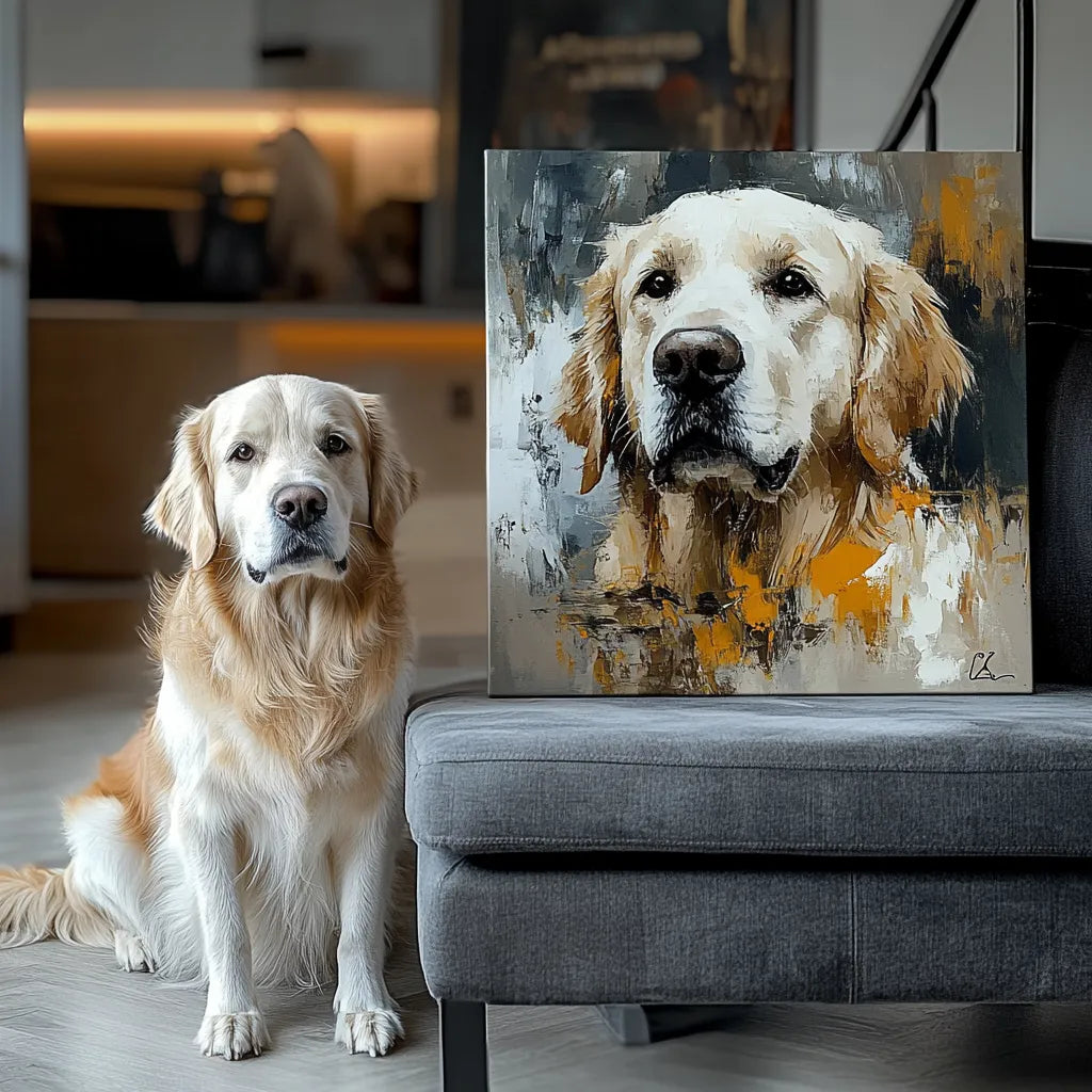
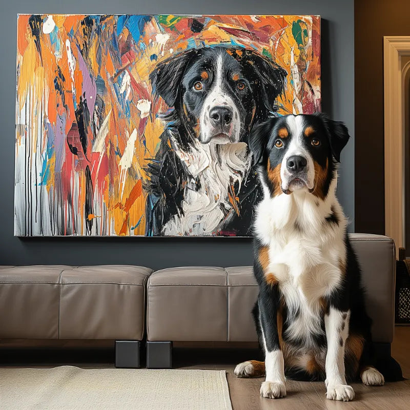

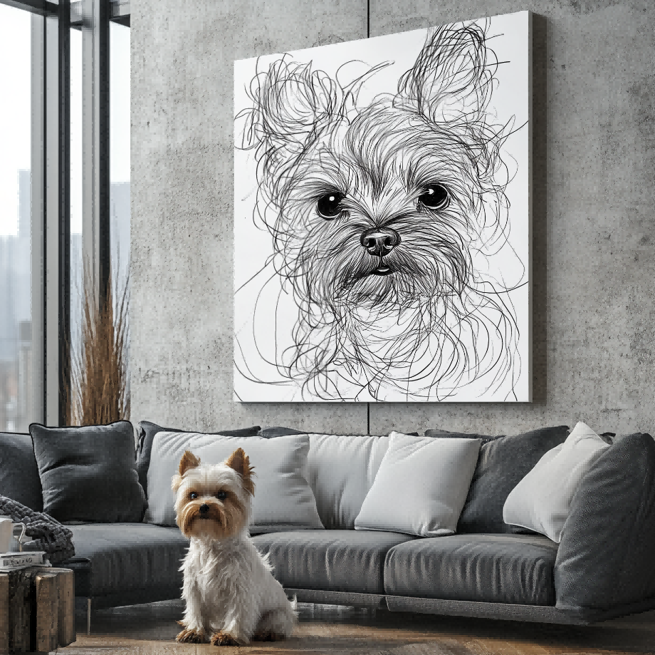

A pet portrait preview on a phone or monitor should help you review the artwork, but it cannot guarantee that every color will look identical on a physical item. Screens create color with emitted light; printed or textured surfaces reflect the light in the room. Display settings, brightness, paper or canvas tone, ink, finish, and viewing conditions can all affect what you perceive.
That does not make a digital preview useless. It means you should use it for the decisions it can support—likeness, composition, markings, relative color direction, text, and obvious errors—without treating an uncalibrated screen as an exact physical color reference.
Why the same file can look different on two screens
Phones often increase brightness, contrast, or saturation. Night modes can warm the display, while blue-light filters can shift whites and grays. A laptop in a bright room may look washed out; the same image on a dim screen may appear deeper and more dramatic. Before approving a portrait, turn off temporary display filters and compare the preview on a reasonably neutral setting.
If a coat marking or eye color is important, describe it in plain language rather than relying on one screen. “The left ear is warm brown, not black” is more useful than “make it match my phone.” Include a clear source photo that shows the feature under natural light whenever possible.
Why physical material and room light matter
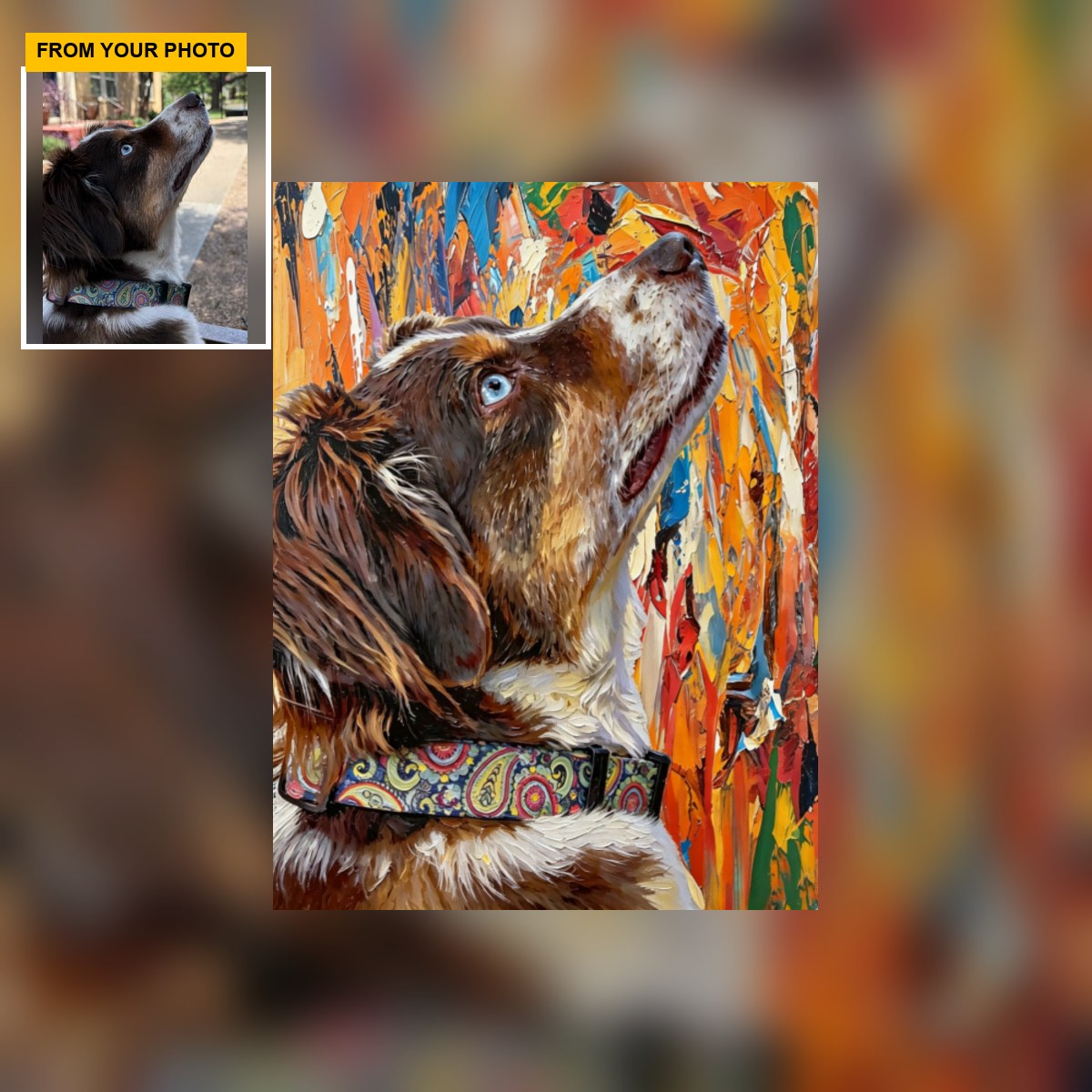
A physical portrait is viewed by reflected light. Warm household bulbs can make neutral areas look creamier, while cool daylight can make them appear crisper. Surface texture and finish can also change how highlights and dark areas read from different angles. A product photograph is helpful evidence of the format, but it still passes through a camera and your screen.
Confirm the live product description for the actual material and finish. Do not infer long-term preservation performance, exact ink behavior, or colorfastness unless the seller supplies current verified specifications. If precise brand colors or a particular paint-chip match are essential, ask whether the service supports that requirement before ordering.

What to review in a digital preview
Check the pet’s identity first: face shape, coat pattern, eye placement, distinctive marks, crop, and pose. Then review broad color relationships. Is a dark pet separated from the background? Are white markings still visible? Does a bright style preserve the features that make the animal recognizable? These questions are more reliable than judging a tiny difference between two neighboring shades.
Use the customer preview checklist for a complete pass. If the source photograph itself has a strong color cast or filter, go back to an unfiltered original before asking the artwork to match it.
Ask how color concerns are handled
Before approval, ask what the preview represents and how the seller handles a material color concern. Does the preview primarily represent artwork and placement? Are small screen-to-product differences expected? Can a concern about a key marking be raised before fulfillment? Policies vary, so use the current listing and written support response rather than an old blog claim.
Do not approve while your screen is in extreme brightness or night mode. If the decision is important, look at the preview on a second device and in normal light. The two displays may not agree perfectly, but a major inconsistency can reveal that the issue is the device rather than the artwork file.
Distinguish identity color from decorative color
Not every color carries the same weight. A pet’s white blaze, amber eye, black ear, or unusual patch may be essential to recognition. A decorative background accent may be more flexible. Tell the seller which colors identify the pet and which are stylistic preferences. That prevents a broad request such as “make it warmer” from accidentally changing a marking that matters.
Start with an unfiltered source whenever possible. The pet portrait photo checklist explains how lighting, focus, and hidden details can affect the evidence available before color decisions even begin.
For a highly stylized portrait, decide whether accurate coat color or the chosen art direction has priority. A bold palette may intentionally move away from photographic color while preserving the pet’s pattern and face. Review that tradeoff explicitly instead of assuming the style name answers it.
Photographing the finished piece is another conversion
If you later compare the physical portrait with its online image, remember that a camera performs another color conversion. Auto white balance, exposure, room light, and phone processing can shift the photograph. Place the piece in neutral light and avoid judging it from a single auto-enhanced snapshot. If a genuine issue remains, document the conditions and contact the seller under the current policy.
Set the right expectation
The goal is a faithful, recognizable artwork—not a promise that emitted light and reflected color will be identical. Review the details your screen can communicate, verify the physical product facts, and raise important color concerns in words. That creates a clearer approval decision than chasing an exact visual match across devices.
When you want to see current artwork formats and verified examples, explore custom pet portraits. For room-related color decisions after ordering, the portrait color palette guide can help you think about surrounding decor without replacing current product specifications.


