

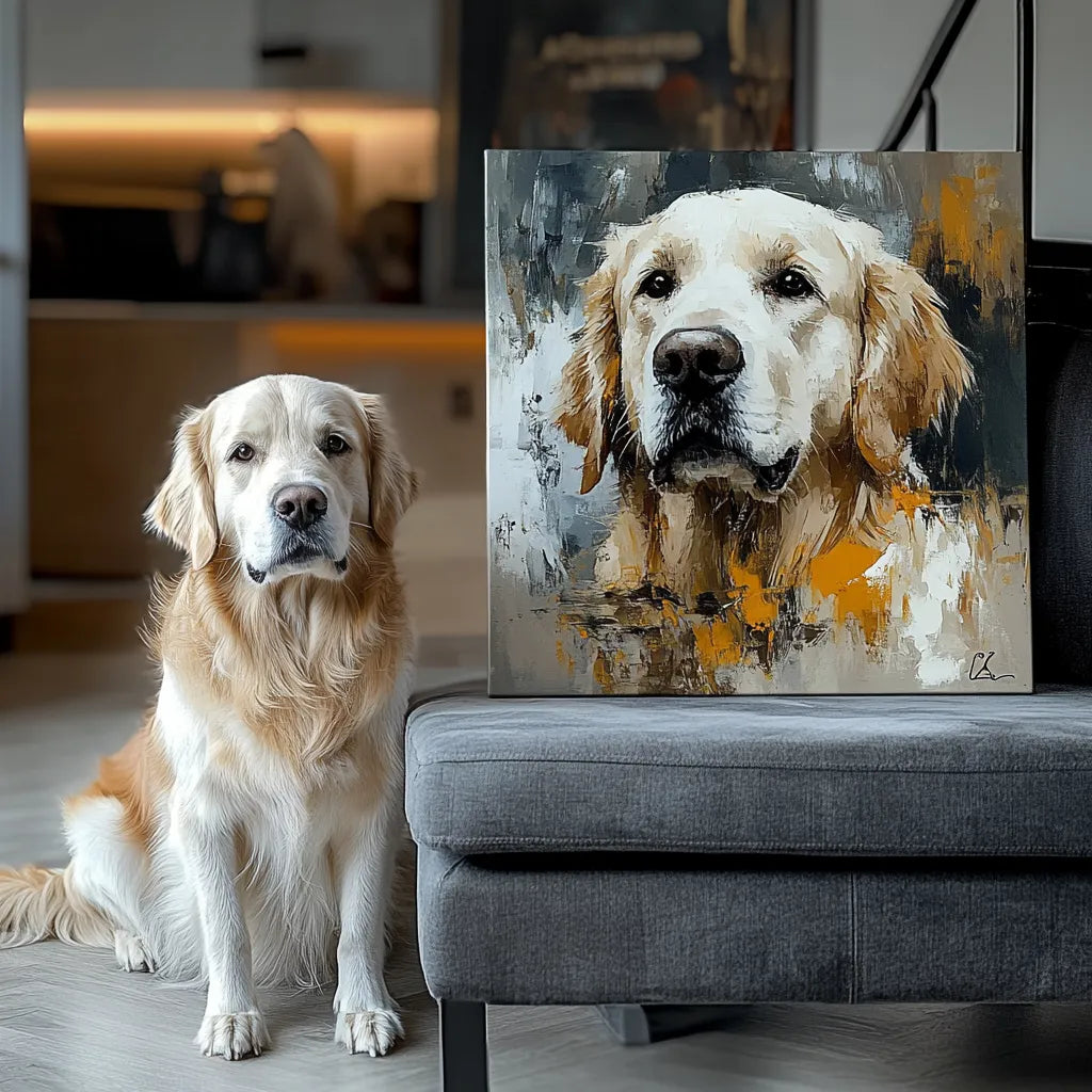
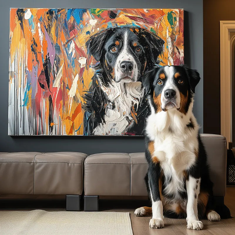

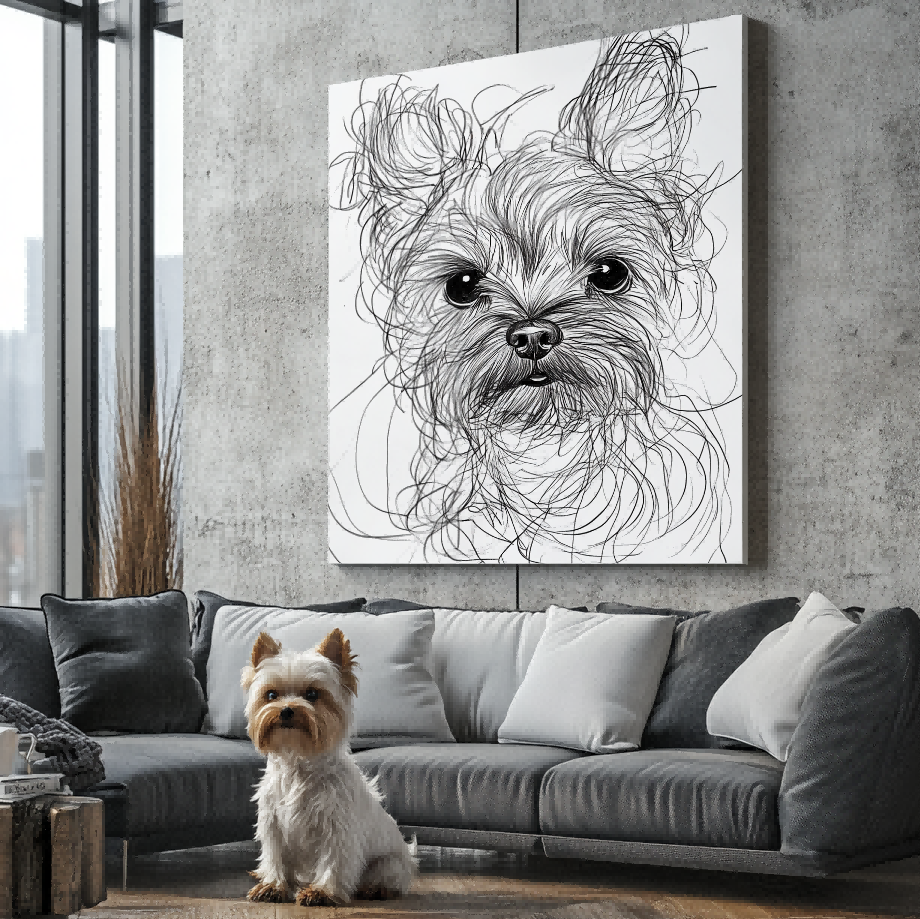

Direct answer: A pet name or short line of text can make a custom pet portrait more personal, but it should be planned as part of the composition rather than added as an afterthought. Confirm the exact spelling, capitalization, placement, and visual weight before approving the artwork. Keep wording short enough to remain readable at the selected portrait size.
Start with the current custom pet portrait options and confirm that the chosen style supports the personalization you want. Name or text support should never be interpreted as unlimited layout freedom; the selected product, artwork style, and approved preview remain the authority for the final result.
Decide what the words need to do
A pet name identifies the subject. A date can mark a meaningful moment. A short phrase can add context to a memorial or gift. These are different jobs, so decide on the purpose before choosing a font or placement. If the words repeat information that is already obvious, the portrait may feel crowded.
Write the wording exactly as it should appear. Check punctuation, accents, spacing, and capitalization. Avoid sending several competing versions without identifying the final choice. A clean instruction reduces the chance that a layout decision is based on an outdated note.

Keep the text short and visually secondary
The pet should remain the primary entity. One name or a brief phrase is easier to balance than a paragraph. Long wording can reduce the available space for the face, ears, coat markings, or background. If a longer message matters, consider placing it on a card or in a gift note instead of forcing it into the artwork.
Readability also depends on size. Letters that look comfortable in a screen preview may feel small when the portrait is viewed across a room. Review the selected dimensions and ask whether the text has enough contrast without overpowering the pet.
Choose placement after the crop is clear
Text near the bottom often works when the portrait has open space below the pet. Side placement may fit a centered head-and-shoulders crop. Top placement can compete with ears or tall compositions. Use the pet photo selection guide first, because the source photo determines where open space naturally exists.
Do not assume the same placement works for every photo. A full-body image, a close face crop, and a two-pet composition create different negative-space patterns. Let the composition guide the text rather than using a fixed template.
Match the wording to the portrait style
A minimal style usually benefits from restrained typography. A playful portrait may support a more expressive treatment, while a memorial piece often needs quiet visual balance. Style describes appearance; it does not prove the material, finish, or framing of the physical product.
Use the custom pet portrait style guide to decide whether the artwork should feel modern, painterly, graphic, or understated. Then evaluate the name or text as a supporting element within that style.

Review spelling and hierarchy in the preview
The preview is the right place to check the pet’s likeness and the text together. Verify spelling letter by letter. Check whether the name is readable, whether it sits too close to an edge, and whether it competes with the face. A screen preview is artwork evidence; it is not proof of an unshown physical finish.
Follow the preview and revision process before approval. If the text is wrong, request the correction while the artwork is still in the review stage. Once approved, the wording should be treated as final for production.
Use customer examples carefully
The Customer Preview Gallery can help you see how different compositions balance a pet and surrounding space. Use examples for visual planning, not as a promise that every layout, font, or placement is available for every product.
A simple approval checklist
- The pet name or phrase is final and correctly spelled.
- Capitalization and punctuation match the order request.
- The text supports the pet rather than becoming the main subject.
- Placement avoids ears, facial features, and important markings.
- Contrast remains readable at the selected size.
- The preview reflects the intended wording before approval.
Frequently asked questions
Should I add both a name and a date?
Only when both details have a clear purpose and the composition has enough space. One strong element is often easier to read than several small lines.
Can I use a long quote?
A long quote can compete with the portrait and become difficult to read. A short phrase or name usually preserves the visual hierarchy more effectively.
Does text change the portrait size?
The selected product size does not automatically change because text is requested, but text can affect how the artwork is composed within that space.
What should I check before approval?
Check exact spelling, position, contrast, edge spacing, and whether the pet remains the visual focus.
Think about where the portrait will be viewed
A portrait placed in a hallway, office, or living room is often read from several feet away. Test the name at a smaller preview size and ask whether it remains understandable without pulling attention away from the pet. For a gift, consider whether the recipient normally uses a formal name or a nickname. The most meaningful wording is not always the longest wording.
Keep a copy of the approved wording with the order details. That record helps distinguish a spelling correction from a later preference change and makes the approval decision easier to verify.
Final decision
Choose name or text personalization when the words add meaning that the image alone does not provide. Keep the instruction short, verify the exact wording, and approve it only after reviewing the complete composition.


