

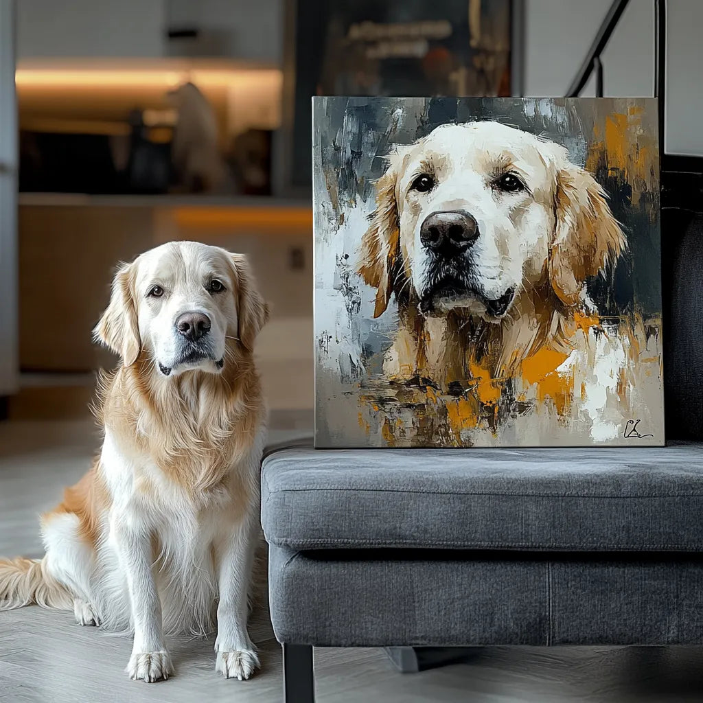
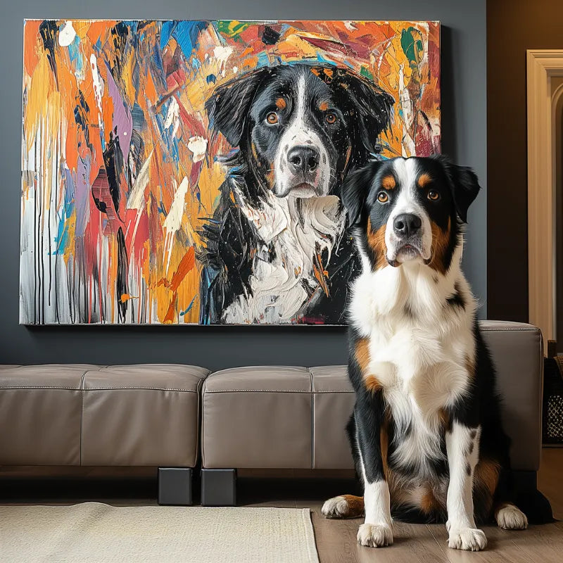

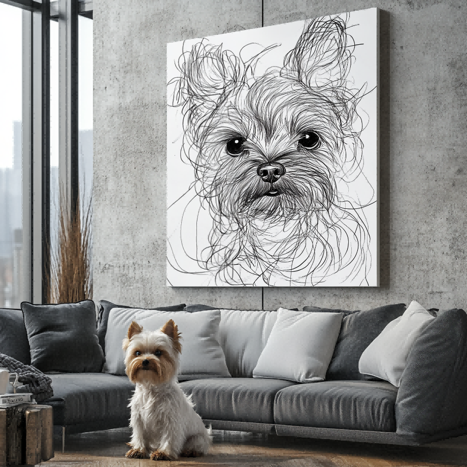

A black-and-white pet portrait can emphasize shape, expression, and contrast. A color portrait can preserve coat hue, eye color, and the emotional energy of a chosen palette. Neither is automatically more artistic or more accurate. The stronger choice depends on which details identify the pet, what the source photo can support, and where the artwork will be displayed.
First verify that the current seller and product actually offer the style you want. The examples here show real physical portrait directions, not a promise that every format or design is currently available.
Choose black-and-white when value and shape carry the identity
Monochrome reduces the image to light, shadow, line, and tonal separation. It can make an expressive face feel direct and can work well when the room already contains many colors. It may also help unify reference photos whose color casts do not match, although the seller must confirm what corrections or combinations are supported.
Check that dark fur does not collapse into one flat area and that white fur still has visible form. Black-and-white does not remove the need for detail. The eye area, muzzle edge, ears, and distinctive patches still need enough tonal contrast to remain recognizable.

Choose color when coat hue or palette is part of the story
Color can preserve a copper coat, amber eyes, a pink nose, or a specific collar that matters to the owner. A stylized palette can also add energy that monochrome intentionally removes. Decide whether the goal is natural color, expressive color, or a blend of both, then use the seller’s preview and current style description to review that direction.
Do not assume that “color” means photographic accuracy. Watercolor, pop, abstract, and textured directions may reinterpret hue. The pet portrait style guide helps you separate the medium or style decision from the simple presence of color.

Let recognizable markings decide
Some pets are identified strongly by color: a calico pattern, one blue eye, a rust-colored eyebrow, or a particular patch. If removing hue makes two markings merge into the same gray value, color may protect likeness better. Other pets have a strong silhouette or face structure that remains clear in monochrome.
Convert the source photo to grayscale as a rough test, but do not treat a phone filter as the final artwork. Check whether the eyes remain distinct, whether the face separates from the background, and whether important patches still read. Use the likeness checklist to identify what cannot be lost.
Consider the room without letting decor erase the pet
A monochrome piece can sit quietly in a minimal room, while a color portrait can become a focal point. But room matching is secondary to the pet’s identity. Do not choose a neutral palette that hides a black pet against a dark wall or a color scheme that turns meaningful markings into decorative noise.
Use the portrait color palette guide to compare surrounding colors. Remember that screens and physical surfaces may not appear identical under every light.
What if the source photo has poor color?
An old image may have a yellow cast, faded tones, or uncertain eye color. Monochrome can be an honest direction when reliable hue information is missing, but it should not be used to imply that any damaged source can be repaired. If natural color matters, provide another authorized reference taken in neutral light and explain which image controls color.
Ask the seller whether the preview represents a monochrome conversion, a newly interpreted palette, or another current style. Never infer the process from the example alone.
Compare the same decisions, not unrelated examples
When possible, compare monochrome and color using similar crop, pose, and format. A dramatic black-and-white headshot may feel stronger than a distant color scene because of the crop, not because monochrome is inherently better. Separate the variables: first decide the pet’s expression and composition, then compare palette direction.
Also distinguish a black-and-white source photo from black-and-white artwork. A seller may interpret a color source into monochrome, or use an old monochrome source to create a color artwork only when reliable color evidence is available and that service supports the request. Those are different capabilities.
Questions to ask before approval
- Does the selected live style support monochrome, full color, or both?
- Which markings rely on hue to remain recognizable?
- Is the background meant to be neutral or expressive?
- Does the preview show the palette direction clearly?
- Are you judging on a screen with temporary color filters disabled?
If an answer is uncertain, describe the identity details in words instead of relying on a filter name.
A practical choice
Choose black-and-white when shape, expression, and tonal mood are the priorities. Choose color when hue carries identity or the palette is central to the intended feeling. If both work, compare previews only when the current service supports them rather than forcing one image to answer an option the seller does not offer.
When you are ready, explore current custom pet portraits and verify live style, format, and product facts before ordering.


